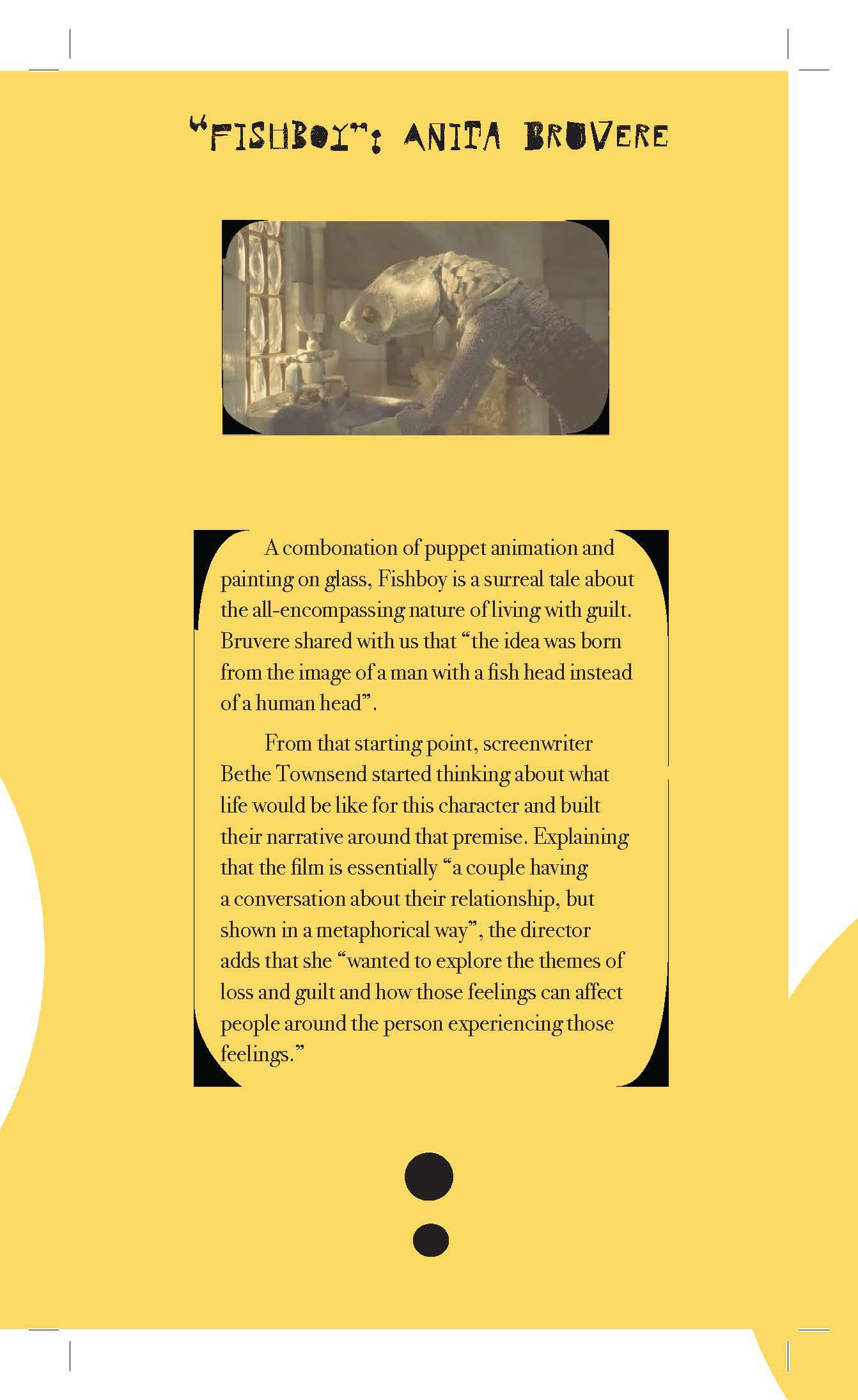
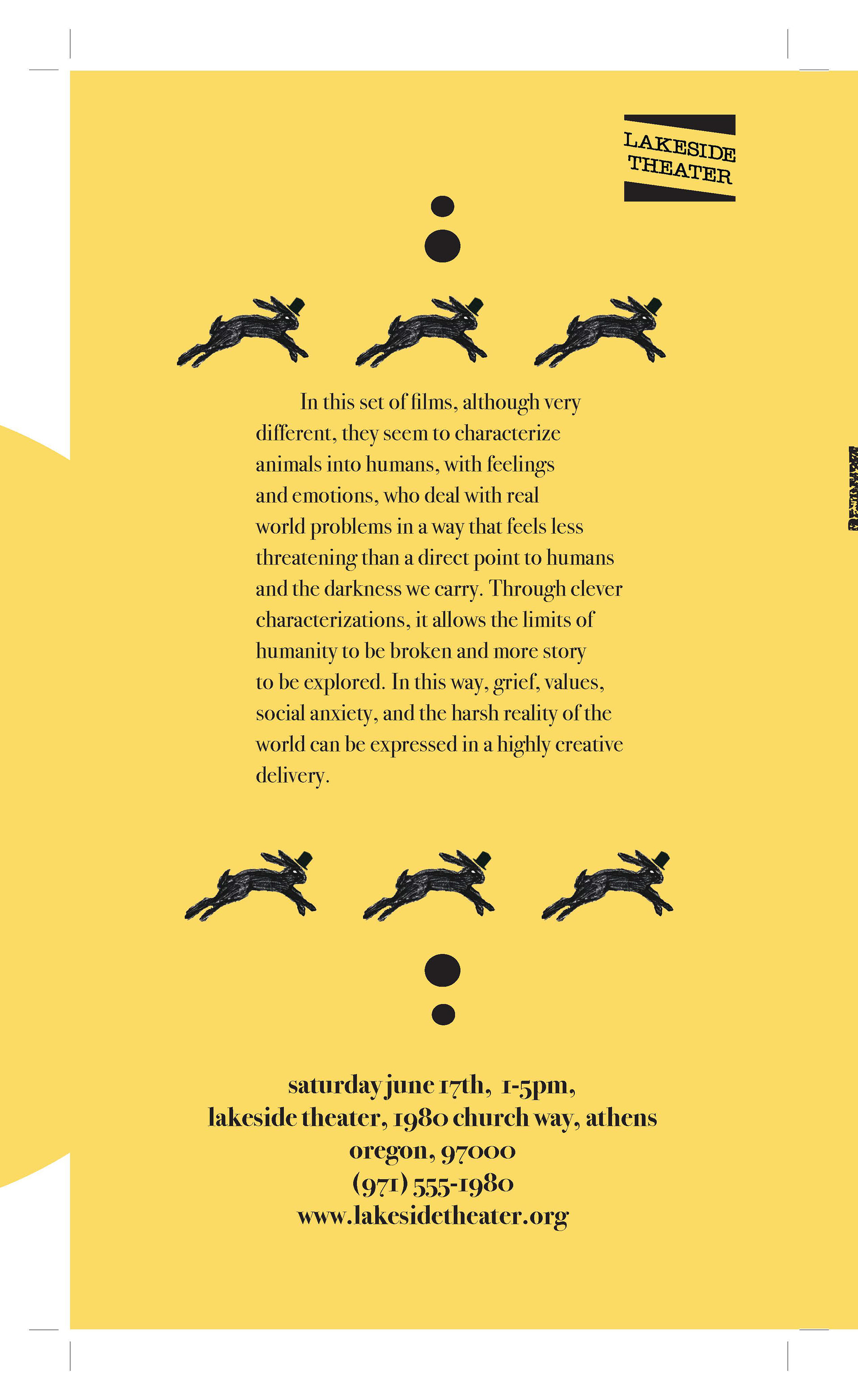
This was a fictional film festival that the students in my cohort were expected to make their own unique branding for. We were tasked with finding several short films and curating them to match a certain theme. The theme that I wanted to include was anthropomorphic stop motion. Our final deliverables were a printed, foldable pamphlet and postcard. As you can see below, I created these, with a vibrant yellow theming. I wanted to call back to the fact that stop-motion has nostalgia that is inherent within it. I picked a hare for the logo, with a top hat to signify that there was a a touch of human-ness within it, as is the case with anthropomorphic animals. I chose a font that was much like a stamped texture to give that feeling of unclean, roughness that stop-motion and animals have.
All pages of the brochure included below.


